In the realm of modern cinema, few directors command the visual spectrum with the same precision as Denis Villeneuve. In Blade Runner 2049, color isn't just an aesthetic choice; it’s a narrative engine. Working alongside legendary cinematographer Roger Deakins, Villeneuve uses a rigorous "color script" to define the emotional and physical boundaries of a dying world.
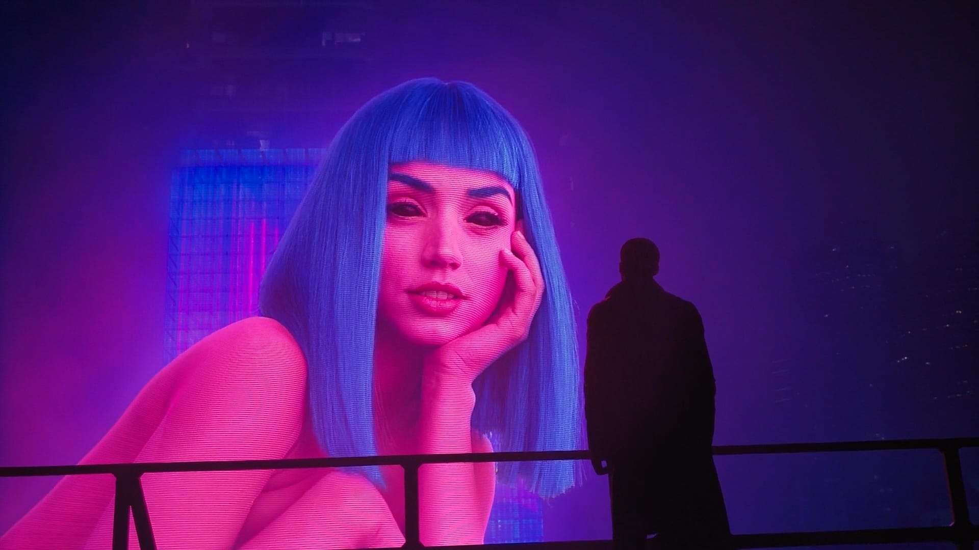
Color is not decoration. It’s structure.
— Roger Deakins
The Spectrum of Desolation
The film’s visual identity is built on a series of monochromatic environments that isolate the protagonist, K, both geographically and existentially. Each shift in the color palette signals a transition in the story’s mood and K’s internal state.
1. The Brutalist Blue (Los Angeles)
The film opens in a rain-soaked, smog-filled Los Angeles dominated by cold blues and oppressive greys. This palette reflects:
- The lack of "real" life: Everything is synthetic, cold, and metallic.
- Systemic stagnation: The monochromatic blue suggests a world where nothing grows and time has slowed to a crawl.
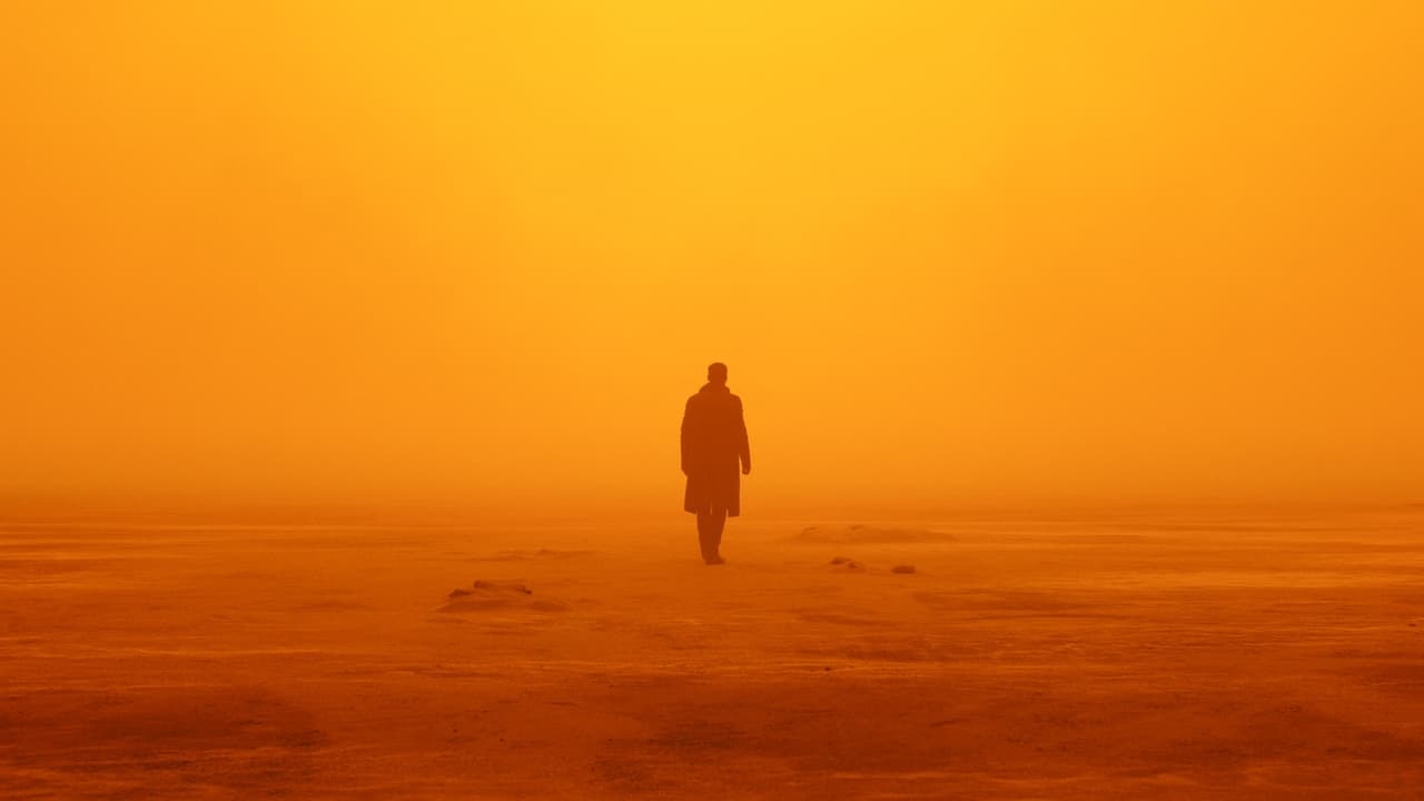
2. The Radioactive Orange (Las Vegas)
The sequence in Las Vegas is perhaps the most iconic use of color in recent film history. The oppressive orange haze serves a dual purpose. It creates a sense of tactile heat and radiation, but it also evokes a "sepia" memory of a world that no longer exists—a ghost of the past.
Technical Breakdown: Emotional Mapping
To understand how these colors function, we can look at the primary hues used throughout the film's three-act structure:
| Color Palette | Location | Symbolic Meaning |
|---|---|---|
| Cool Blue/Grey | Los Angeles | The synthetic present, Melancholy |
| Deep Orange | Las Vegas | Nostalgia, Danger, Buried secrets |
| Sterile White | Wallace Corp | God-complex, Pure cold perfection |
| Vibrant Pink | Joi (Holograms) | False Intimacy, Commercialized emotion |
Color is the keyboard, the eyes are the harmonies, the soul is the piano with many strings. The artist is the hand that plays.
The Synthetic Warmth of Pink and Purple
The use of vibrant magenta and violet is almost exclusively reserved for Joi, the AI hologram. In a world of desaturated grime, these "unnatural" colors are the most vibrant things K interacts with.
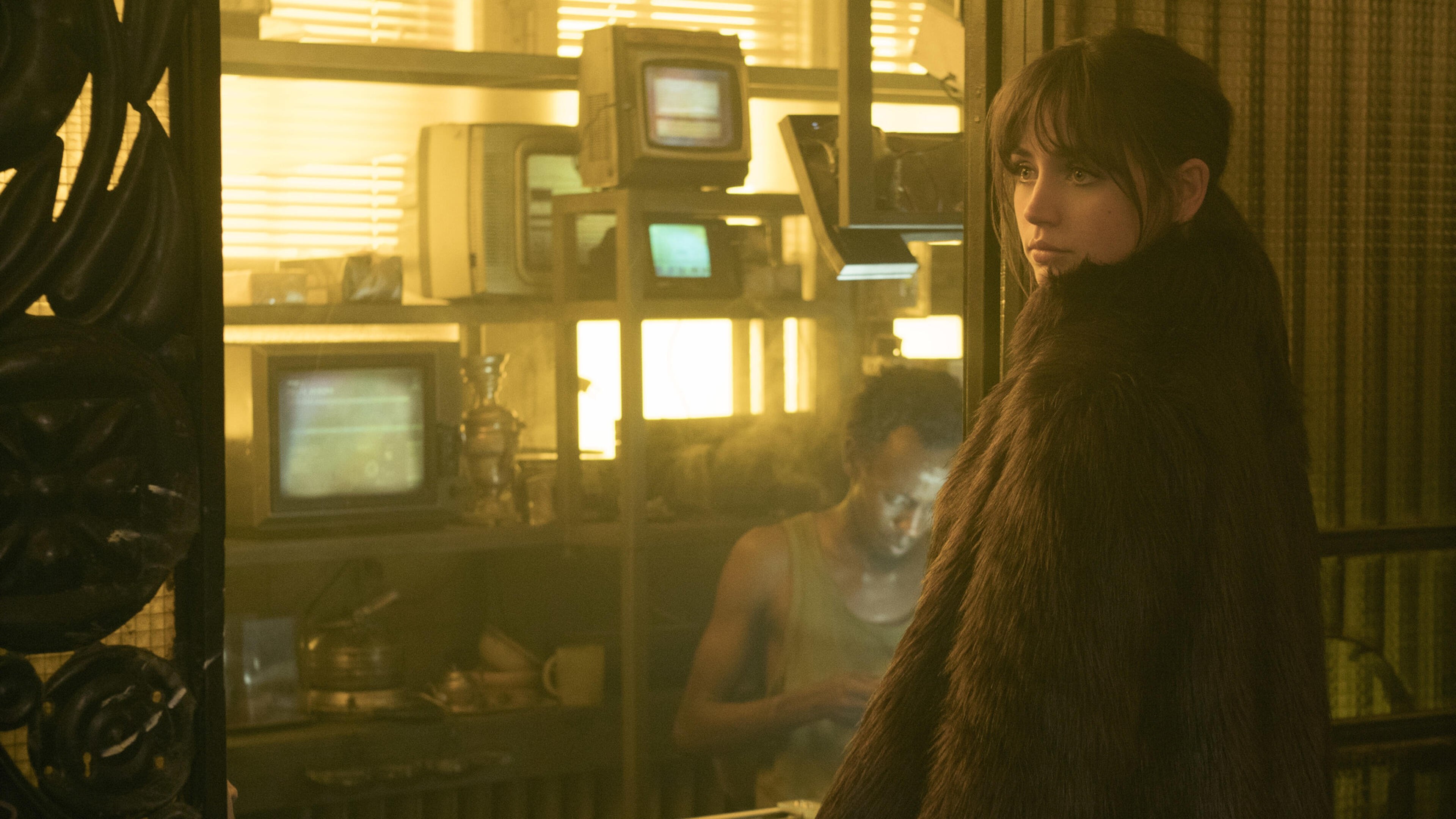
It’s a cruel irony: the most beautiful colors in his life belong to something that isn't technically there. This contrast forces the viewer to question the nature of reality. If the only warmth K feels comes from a programmed purple glow, does that make the warmth any less real?
Conclusion: Designing the Future
Villeneuve’s visual language proves that minimalism in color doesn't mean a lack of depth. By restricting his palette to specific "zones," he creates a world that feels vast yet claustrophobic.
For designers and cinematographers alike, Blade Runner 2049 remains a masterclass in how to use visual constraints to tell a more expansive story.